Light and Shade
Strand 1 - Paul Catherall
Paul Catherall is an artist that creates simplistic, geometrical linocuts of famous brutalist buildings, with his style able to be recognised everywhere in the UK. I chose his work as inspiration for my first strand because he manages to find a way to create simplistic, abstract art yet still makes it's source and inspiration easily recognisable, such as St. Paul's cathedral.
Here are some of his images (Below):

|

|

|
And here are the images I took in response, photographed around Muswell Hill:


Best images:

|

|
Final edited image:
WWW: I believe I took clear and interesting images and mimicked the style of Catherall quite well
EBI: I could have added more detail and taken a larger variety of images
EBI: I could have added more detail and taken a larger variety of images
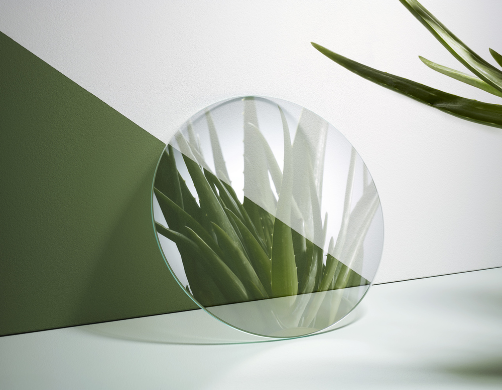
Strand 2 - Coppi Barbieri
Coppi Barbieri
Reflections and refractions through glasses.
https://www.creativereview.co.uk/still-life-masters-coppi-barbieri/
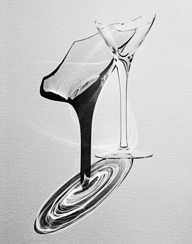
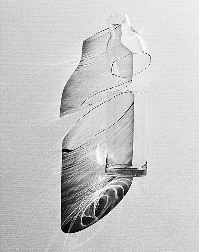
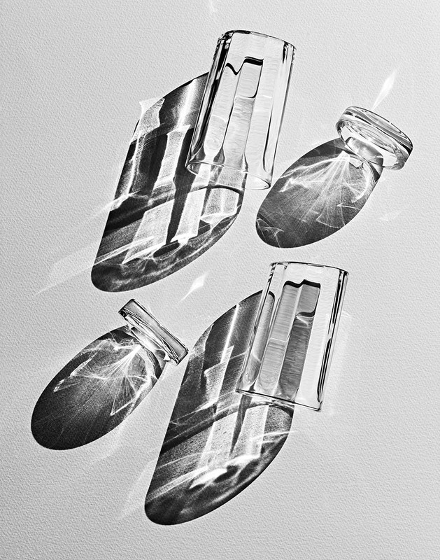
In this strand, I looked at the style of Coppi Barbieri, a duo who take pictures for passion. Their series "interiors and objects" contains images such as the ones below, highlighting the refractive properties of glass while keeping the translucent properties
Reflections and refractions through glasses.
https://www.creativereview.co.uk/still-life-masters-coppi-barbieri/
In this strand, I looked at the style of Coppi Barbieri, a duo who take pictures for passion. Their series "interiors and objects" contains images such as the ones below, highlighting the refractive properties of glass while keeping the translucent properties
|
|
|
And here are the images I took in response:


Best images:

|

|

|
WWW: I took a good range of images that includes a variety of shadows
EBI: I could have tried to make the edges of the shadows and images in general much clearer and crisp
EBI: I could have tried to make the edges of the shadows and images in general much clearer and crisp
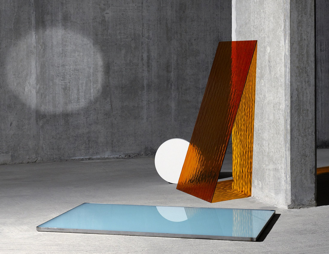
Strand 3 - Kate Jackling
Kate Jackling
https://wepresent.wetransfer.com/stories/kate-jackling-fifty-fifty
In the studio- coloured acetates etc and textured glass.
https://wepresent.wetransfer.com/stories/kate-jackling-fifty-fifty
In the studio- coloured acetates etc and textured glass.

|
|
|
And here are the images I took in response:


Best images:

|

|
WWW: I used a great variety of colours, shapes, and reflective objects to create unique and interesting images
EBI: I could have used more solid objects to add texture or different colours of backgrounds
EBI: I could have used more solid objects to add texture or different colours of backgrounds
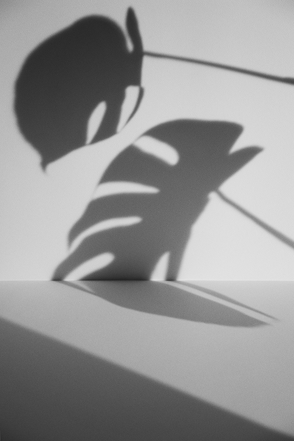
Development 1 - Ana Dominguez
Ana Dominguez
https://www.ignant.com/2018/11/01/the-art-of-balance-a-conversation-with-ana-dominguez-on-graphic-design-and-absurdity/
https://www.ignant.com/2018/11/01/the-art-of-balance-a-conversation-with-ana-dominguez-on-graphic-design-and-absurdity/

|
|
And here are the images I took in response:


Best Images:
WWW: I took a good variety of images, all with different shapes and forms
EBI: I could try to make the shadows darker/clearer and try not to let the shadow get cut off at the edge of the paper
EBI: I could try to make the shadows darker/clearer and try not to let the shadow get cut off at the edge of the paper
Development 2 - Wolfgang Tillmans
wolfgang tillmans
"paper drops"
very shallow depth of field
drops out of focus
https://tillmans.co.uk/biographybibliography/5-biography-english
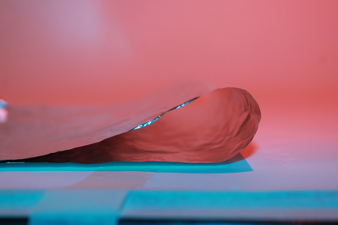
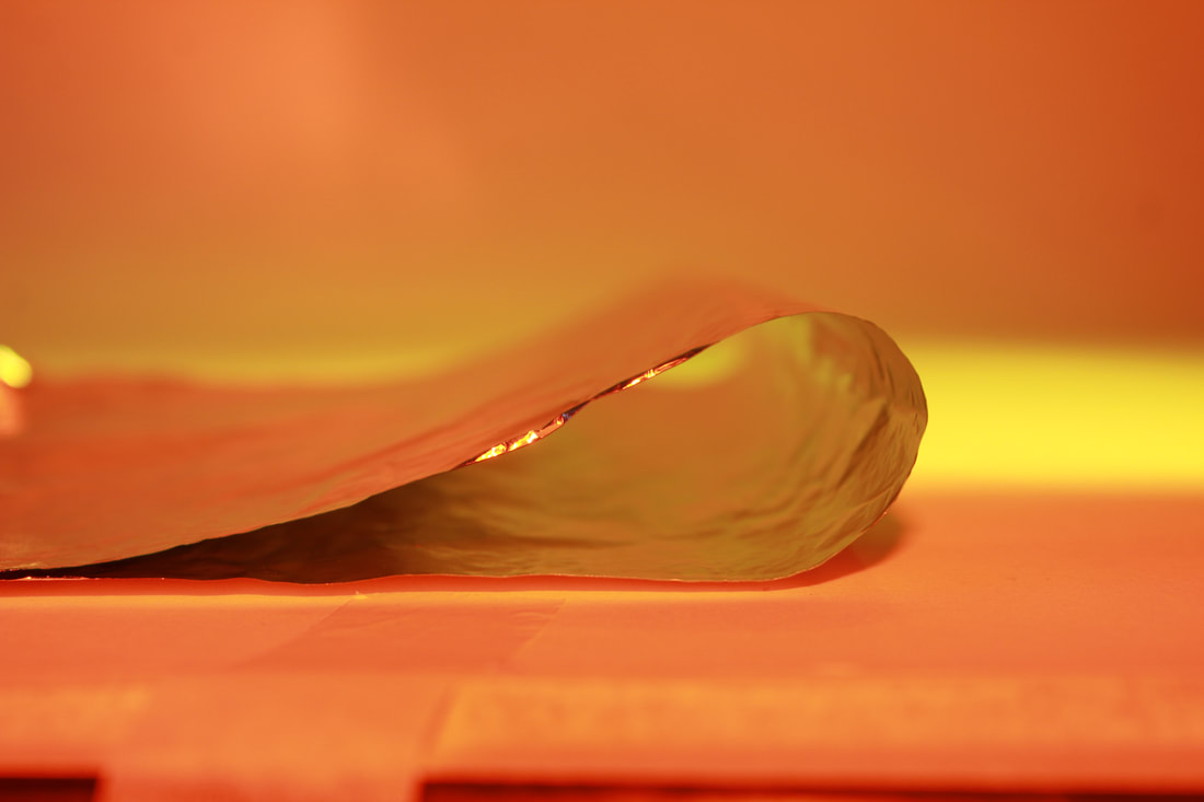
In this next development, I decided to take inspiration from Wolfgang Tillmans, a photographer from Germany who has an extensive bibliography. The use of a shallow depth of field gives a hazy effect to the image while also keeping focus on the "drop" shape the paper produces. The focus of the image is the edge of the paper, highlighting the very different inside of the paper that almost seems like a portal into a different world or place. The use of focusing on the edge also adds a sharp contrast that appears clear despite most of the image being out of focus.
I feel this quote from Tillmans himself best shows the source of his inspiration for the series:
"One evening in 2000, I was walking around my studio and I had this realization that everything I do is on paper. Soon after I made a picture of this big sheet of red photo paper, which I hung attached only on one corner. I observed how it curled and how the sharp sunlight brushed it, and how this paper was sort of falling. That’s how the name paper drop came about"
- Davidzwirner.com
"paper drops"
very shallow depth of field
drops out of focus
https://tillmans.co.uk/biographybibliography/5-biography-english
In this next development, I decided to take inspiration from Wolfgang Tillmans, a photographer from Germany who has an extensive bibliography. The use of a shallow depth of field gives a hazy effect to the image while also keeping focus on the "drop" shape the paper produces. The focus of the image is the edge of the paper, highlighting the very different inside of the paper that almost seems like a portal into a different world or place. The use of focusing on the edge also adds a sharp contrast that appears clear despite most of the image being out of focus.
I feel this quote from Tillmans himself best shows the source of his inspiration for the series:
"One evening in 2000, I was walking around my studio and I had this realization that everything I do is on paper. Soon after I made a picture of this big sheet of red photo paper, which I hung attached only on one corner. I observed how it curled and how the sharp sunlight brushed it, and how this paper was sort of falling. That’s how the name paper drop came about"
- Davidzwirner.com

|

|

|


Here are what I believe are the three best images:

I feel as though I mimicked Tillmans' style, yet kept the image unique through the use of - instead of paper.
|
I feel as though this image has kept the use of Tillmans' style while also incorporating an almost Kate Jackling-like approach. I will be developing this style more.
|

While this image is more simple, it's one of the best in terms of quality and composition
|
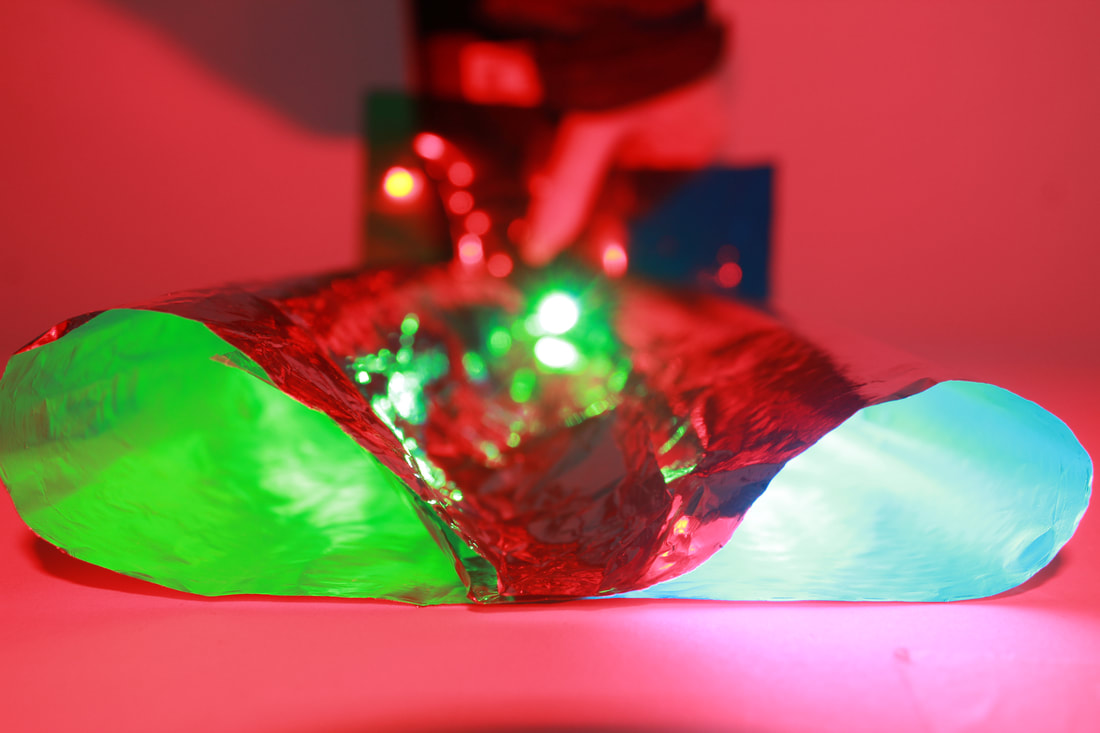
Development 3 - Combining
Combining Jackling, Domingues, and Tillmans
After some experimenting with Tillmans' technique of keeping one area in focus while the rest fades out of focus, I realised that I could combine Tillmans' depth of field, Domingues' interesting shapes of paper, and Jackling's use of abstract colours.
Here are the images I took:
After some experimenting with Tillmans' technique of keeping one area in focus while the rest fades out of focus, I realised that I could combine Tillmans' depth of field, Domingues' interesting shapes of paper, and Jackling's use of abstract colours.
Here are the images I took:


Here are the images I feel came out best:
|
|
